I'm sorry, Dave. I'm afraid I can't do that.

Thursday 29 April 2010

UNIVERSE SCANS

Some scans from my 'UNIVERSE - A Journey to the Edge of the Cosmos' book. i am going to use these later on in my work.


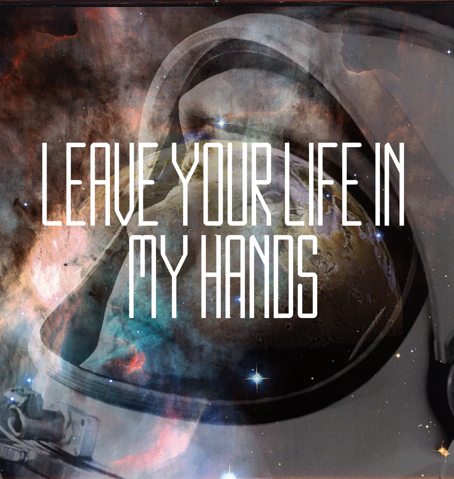
This piece i did using the scans as well as a picture of an astronaut from one of the website recommended by OBNX MUTE. it uses my Apollo font and the phrase "Leave Your Life In My Hands" - i felt this could be similar to something HAL from 2001: A Space Odyssey would say.

ARTHUR C. CLARKE


When researching for various aspects of retro design i found myself drawn towards the old book covers for Arthur c. Clarkes' sci-fi novels. I love the typography, colours, geometric shapes and imagery. I could think about re-branding them and giving them a fresh new look and feel (possibly using my Apollo typeface)

OBNX MUTE


Recently i stumbled over the graphic designer Eric Zelinski otherwise known as OBNX MUTE. he produces beautiful cosmic graphics combined with the idea of exploration and geometric shapes. i was so inspired i decided to email him what inspired him and where he got his imagery. Soon after he replied with a few websites i could look at:
http://www.nasa.gov/multimedia/imagegallery (5 or 6 links to massive image galleries)
http://hubblesite.org/gallery/
http://search.creativecommons.org/
http://commons.wikimedia.org/wiki/Main_Page

SILVER (FOIL)

Silver rocks/forms:


Making of very retro helmet (a box covered in foil):


Mysterious facial forms:


From researching into 'The World Of Tomorrow' i have found that throughout design various reflective surfaces are used in architecture, fashion and art. today i have spend a fair amount of time experimenting with what i can do with foil and silver spray paint.

APOLLO (MY OWN FUTURISTIC TYPEFACE)


For this i decided to look at a lot of old fonts that had been used before such as, Star Wars, Back to the Future, Star Trek, I Robot, Tron etc. i discovered that a lot of these were fairly narrow. i looked at the NASA typeface for inspiration as well as retro logos. they use gradients, vibrant colours and textures. I decided to name the font Apollo after the spaceship/mission.

Monday 26 April 2010

NOISE

Photobucket

My first GIF image.

Sunday 18 April 2010

EARTH IS BUT A STAR

Some TRUE retro-futurism:


GOO SERIES


Basically i thought it would be interesting to create some sort of futuristic goo like in the Ambling Alp video (Yeasayer) and also in the Electric Feel video (MGMT). I like the idea of forms or liquids with different textures and properties than they should have, in this case some goo-like liquid with the properties of television noise and distortion.

PETER RANDALL-PAGE


Some work by Peter Randall-Page. I am looking at this because they are almost like natural forms but with unnatural patterns and surfaces. they also stand in the environment like monoliths of thier own, a bit like the one at the beginning of 201: A Space Odyssey:

Saturday 17 April 2010

HOWLING IN SPACE


This is what i think it would look like if (in the future) the planet died and spirits of wolves were left howling in space, thus creating a triangular monolith.

OMNI MAGAZINE (GOODBYE GALAXY)


A beautiful rebranding of the old space magazine Omni by Goodbye Galaxy (Khristian Mendoza)

Thursday 15 April 2010

COSMOS EXPERIMENTS


Cosmos Experiments by Indir Topcagic
(drool)

UNKNOWN


This is a piece i stumbled across on the web. it is some sort of print i don't know who the artist is but i really like the imagery, colours and textures. looks like some sort of 'going's on' in a far away galaxy.

Wednesday 14 April 2010

EVA POD (PROMOTE)

LAVA LAND


More lava lamps/ planets / space scenes. i added a gradient overlay to give the forms more colour.

STRANGE PLANET?


Another image i made. i took a picture of my lava lamp and tried to make it look like some sort of strange planet in an old/retro style.

RETRO 80s FONT/STYLE


This is an effect i created using Photoshop. i think it looks very retro, futuristic and cool.

Monday 12 April 2010

REFLECTIVE FORM


A form i made on illustrator. i used foil and other reflective surfaces for the texture. i wanted it to look foreign and alien like but as if had been there a while. A bit like the monolith in 2001: A Space Odyssey.

TRON


I have recently watched the Disney film Tron. "Tron was written and directed by Steven Lisberger, and has a distinctive visual style, as it was one of the first films from a major studio to use extensive computer graphics".
The film uses a lot of bright neon colours which stand out against dar, gloomy backdrops. I love the use of grids throughout the whole film. i feel that this has lead on to inspire a lot of graphic design as well as computer games. i will be looking to explore this throughout my project.

Saturday 10 April 2010

DAN MCPHARLIN


The Invisible Channel Part I by Dan McPharlin. a lot of the work i have been studying involves grids. i stumbled across this artist when looking at Mark Weavers influences.